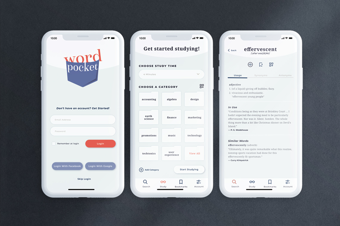
The goal of Word Pocket was to create a vocabulary app for business professionals and students who need a way to reference relevant terminology, check spelling, discover synonyms, and learn definitions, enabling them to stay abreast of changing terminology, write professional communications, and communicate effectively in career and academic settings.
Research Goals
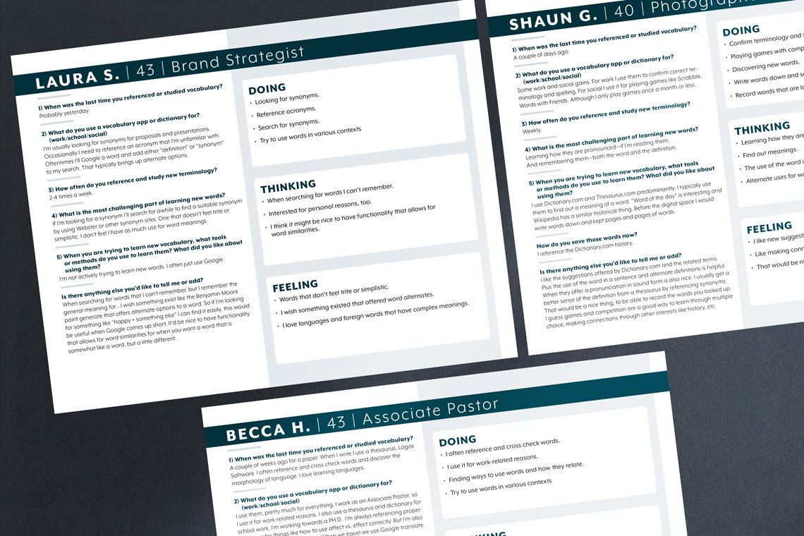
User interviews helped pinpoint common research tools, pain points, motivations, and workplace struggles for users, while also determining the level of need for this type of service.
Key User Insights
• There is a recurring need for this service • The primary use is for career advancement and education • User's possess a fascination for words and their meanings • Interest in saving words for future study or reference • Desire to search and hear pronunciations
User Personas & Task Flow Charts
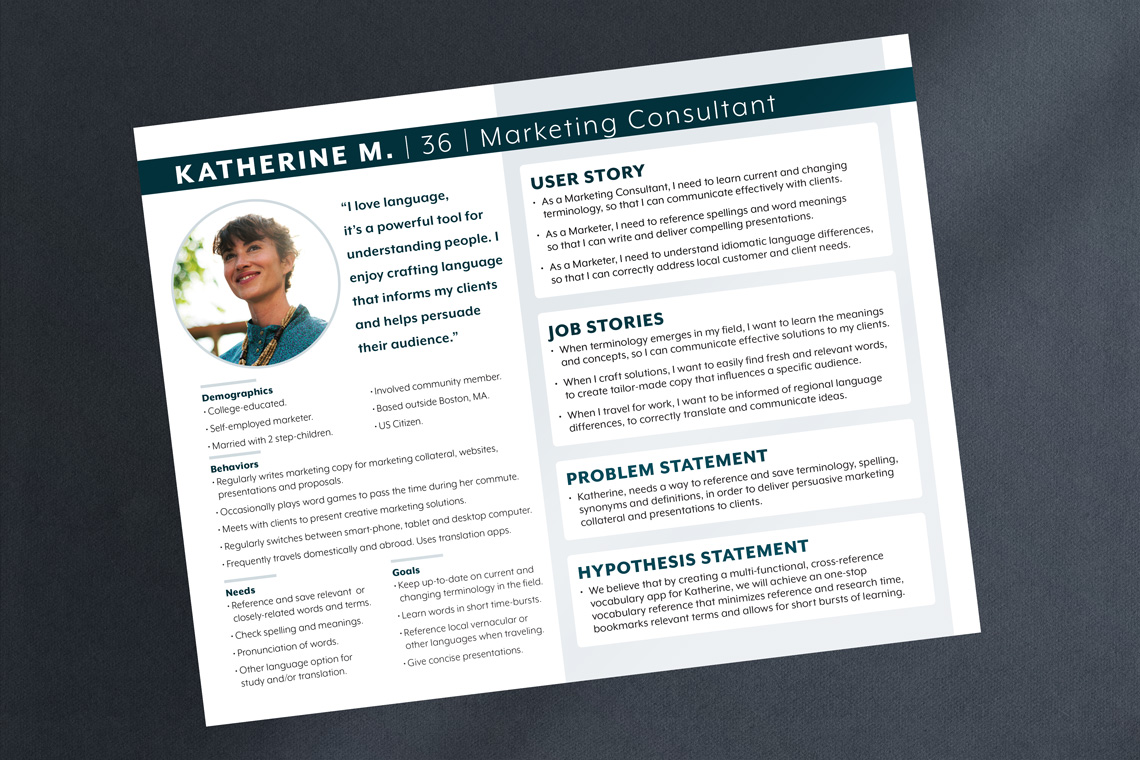
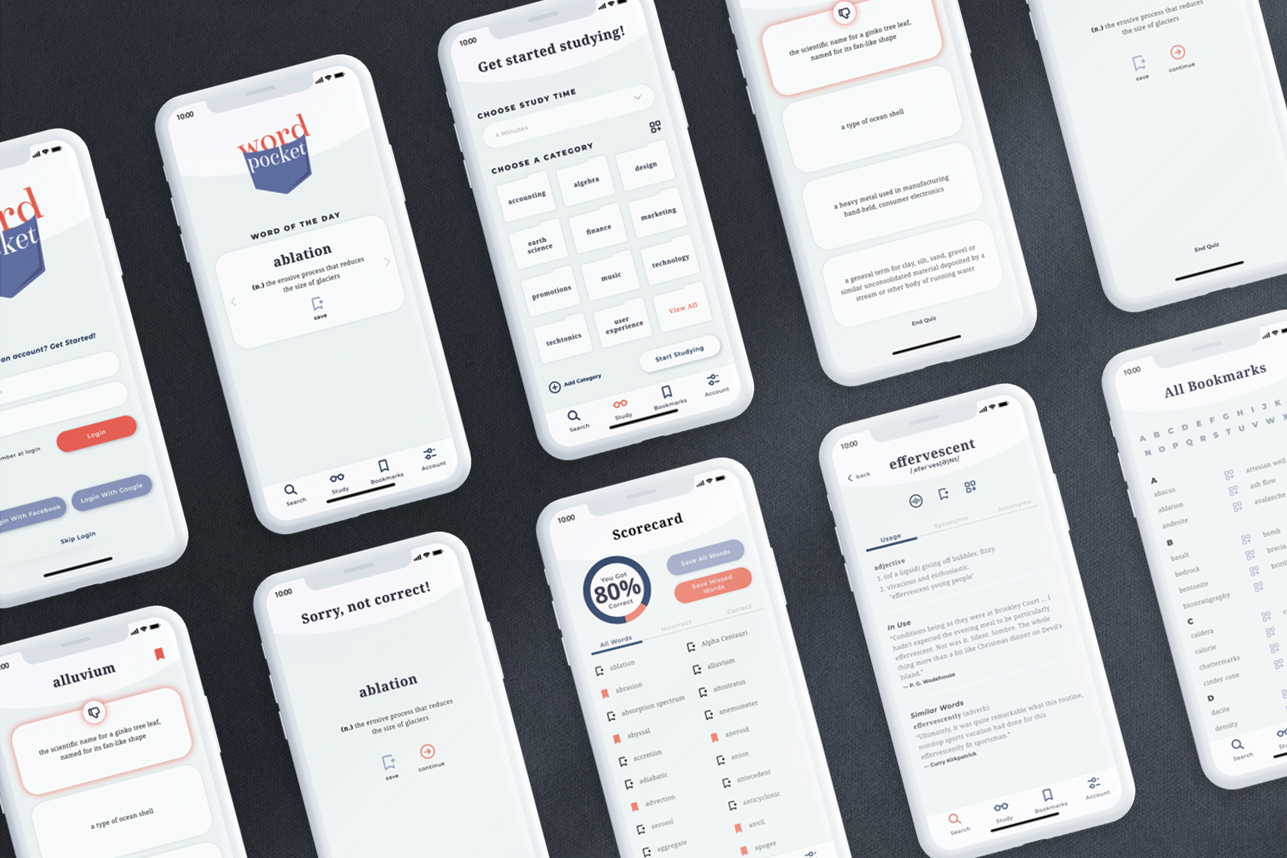
A primary persona, Katherine, is a self-employed marketer that needs access to a vocabulary study app that allows her to stay up-to-date on terminology, save words for recall, and check idiomatic differences between languages for her multi-national clients. From this analysis, task flows were created.
User Motivations
• Stay up-to-date on changing, industry-specific terminology
• Study terms in short, convenient time-bursts • Reference local vernacular when travelling • Communicate clearly and accurately in presentations
Findings from
Usability Testing
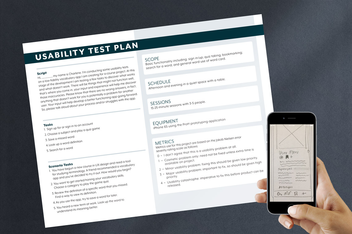
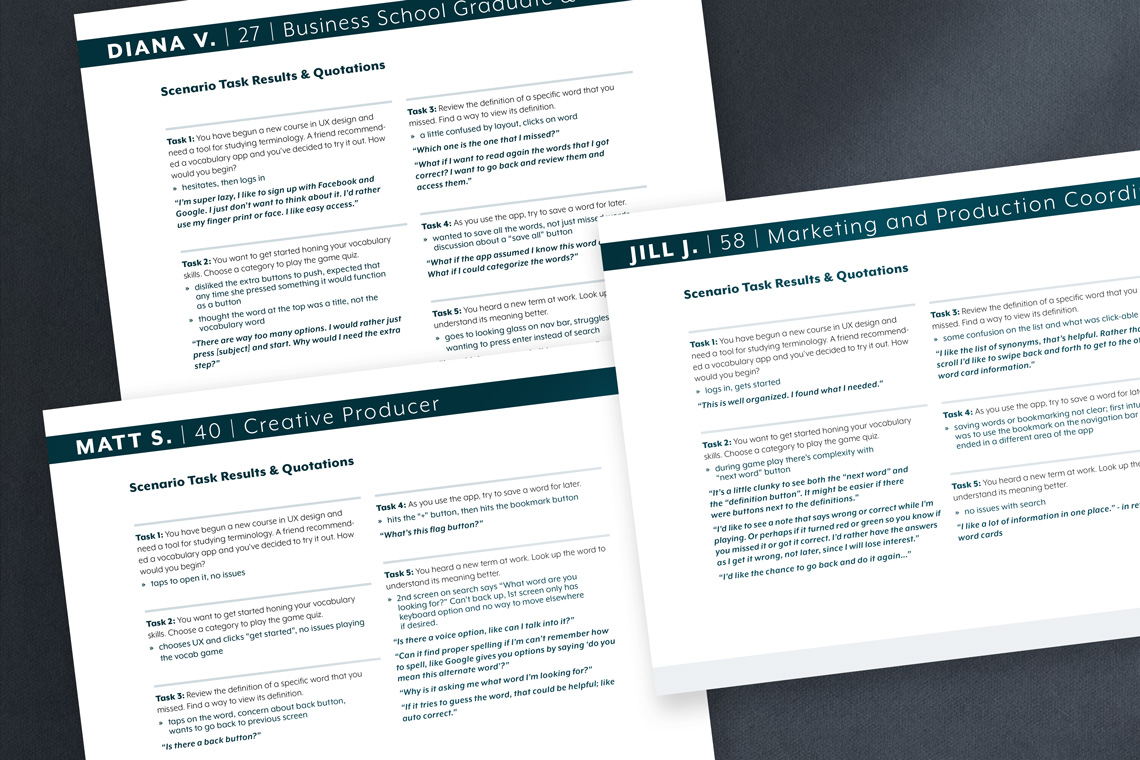
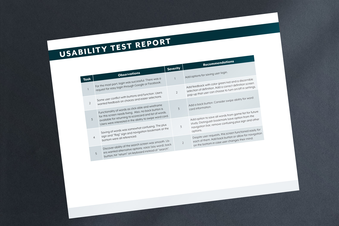
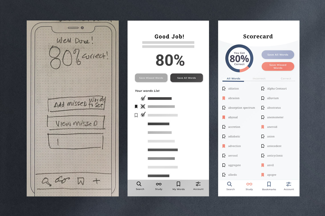
A low-fidelity prototype was created and usability tests were administered to 3 users. Responses from participants were analyzed and the following findings emerged:
• Flow issues existed due to confusing icons & placement of those icons • Missing navigation—a way to return to the previous page
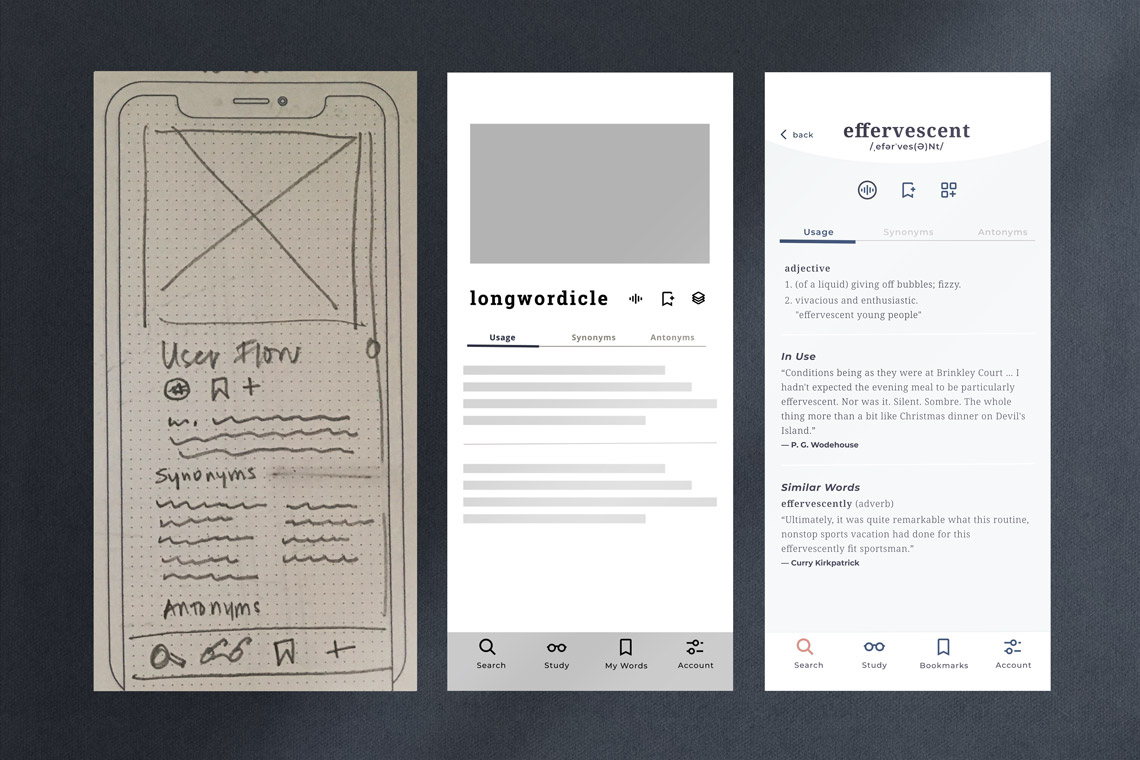
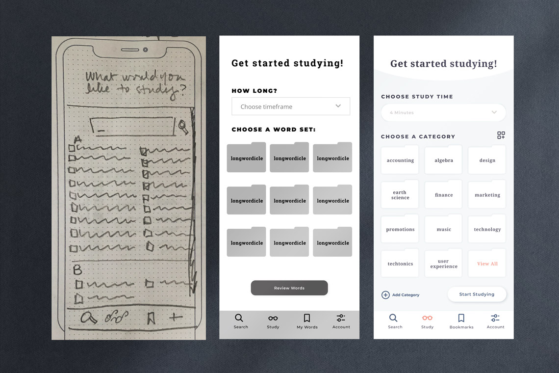
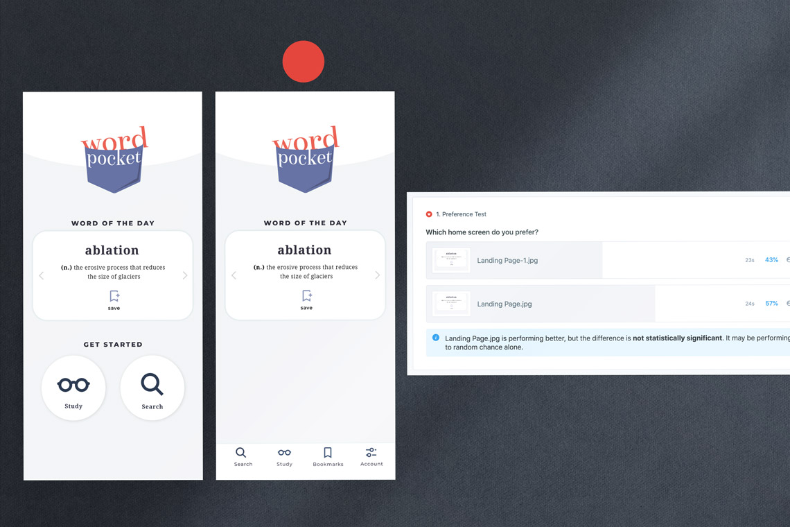
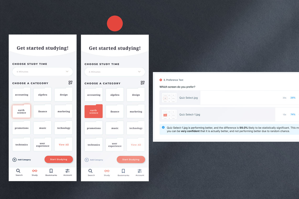
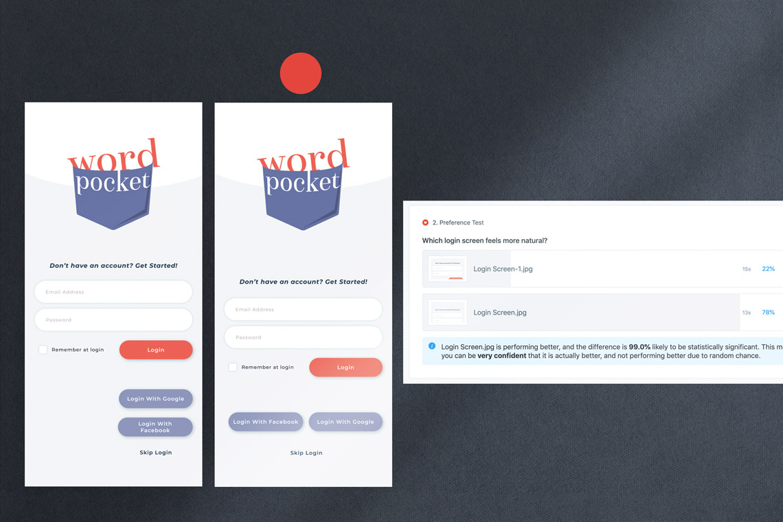
Design Fidelity & Preference Testing
New iterations of the design addressed flow issues from the previous usability testing. Once the higher fidelity iterations were created it became important to conduct an A/B preference test to clarify UI design choices for the home page, quiz category page, and the login screen.
Testing Insights
• 78 to 22—Users chose a more traditional login screen • 74 to 26—Users chose a look for selected elements • 57 to 43— Users chose a home screen that included navigation