Mentor Me App
Problem Statement
Small business owners, young professionals, and freelancers need expert advice from industry-specific experts—allowing them to find viable solutions to various business-related questions that they are less skilled at tackling.
My Role
UX Research, UX Design, UI Design, Branding Design, Illustration
Outcomes
• Increased "find expert" success up almost 60% from initial testing
• Additional user need research required for the learning track feature
• 90% of user comments revealed a positive experience with overall flows saying, "Oh, I liked that, it was really easy to do".
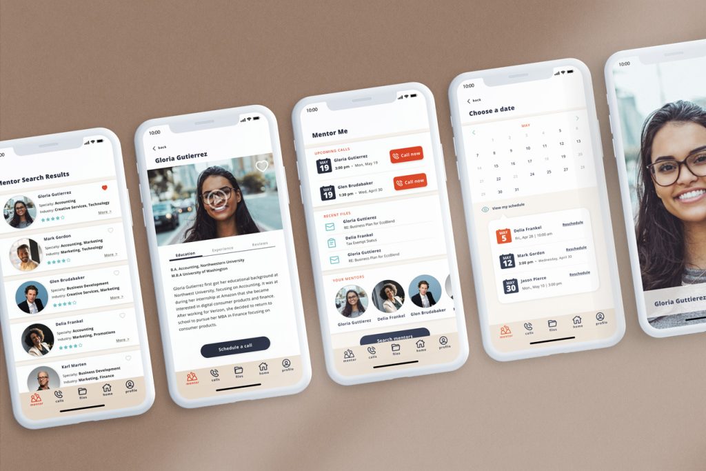
Research
A combination of research methods uncovered pain points, motivations, frequently used tools, and workplace knowledge gaps. These discoveries were used to determine the level of need for a mentorship service.
Discovered Needs
User needs that surfaced were:
1) Desire for professional advice
2) Interest in project-based consultations
3) Semi-frequent intervals
4) Preference for personal interactions via video or messaging
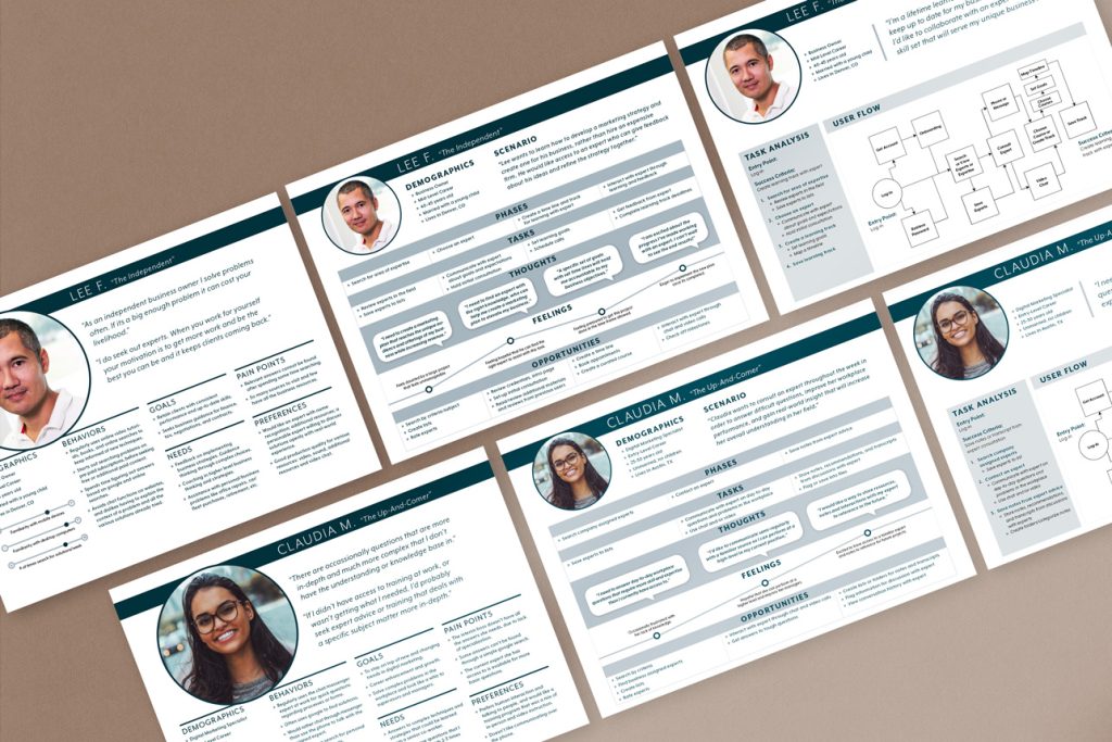
Understanding Users
Two primary personas were created each with their respective journeys and flows.
Design, Test & Iterate
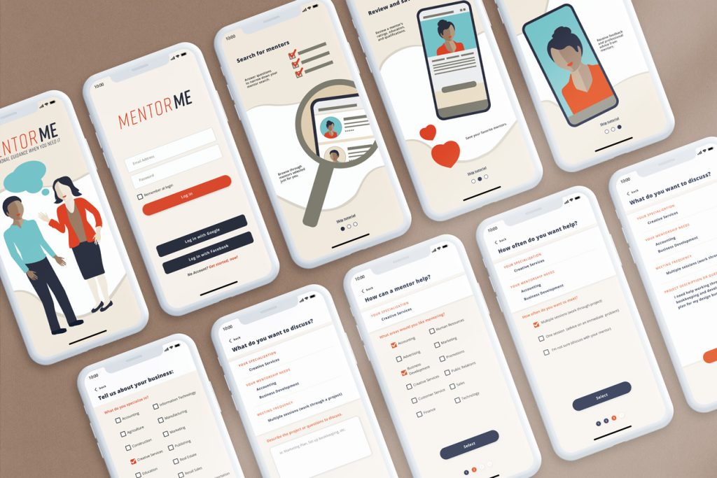
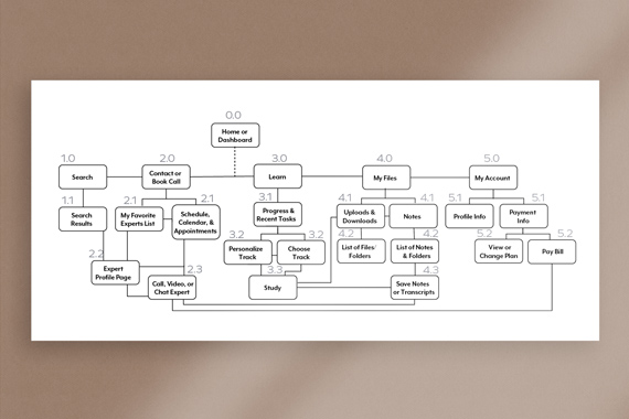
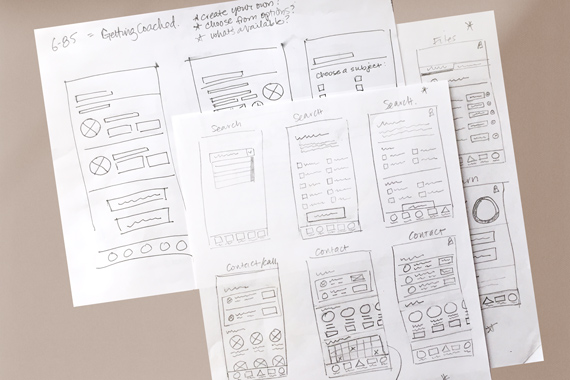
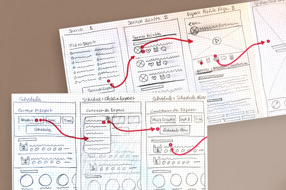
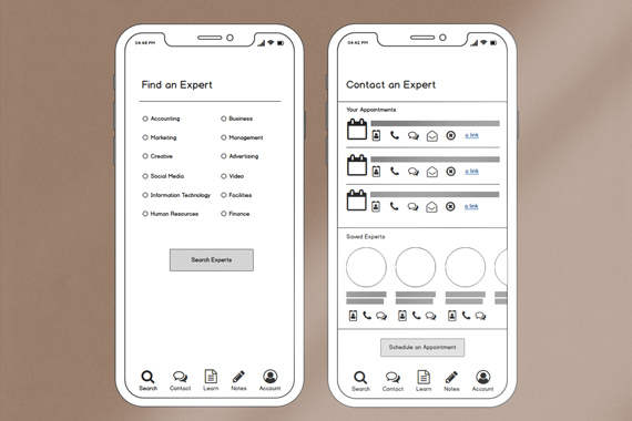
Once the initial site map was created, a card sort was conducted to assess and refine the site architecture from the user's perspective. Design iteration began with low-fidelity wireframes and paper prototypes. As the design transitioned into mid-fidelity wireframes and a digital prototype, it was time to test again. In-person testing revealed some key issues within the one key flow and its functionality.
Key Findings from Usability Testing
1) Confusion around the word "coach"
2) Issues with scheduling on the calendar
3) Duplicate navigation function caused confusion
4) One flow went outside the scope of phase 1
Refining the Calendar
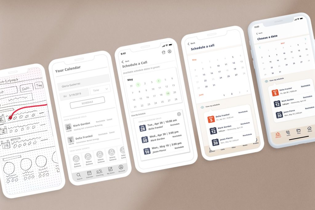
The calendar / scheduling was a particular challenge the following steps were taken to improve it:
• Improve visibility of elements—allow access to user's schedule
• Reduce number of clicks
• Simplify date/time toggling
• Tighten UI elements to reduce overlap of modals
• Created an "add files" function when scheduling meetings
Addressing Issues in the Navigation
Testing revealed a duplication of navigation that caused user's to ask "I already did this, why would I do it another way?". Refinements included the following results:
• 100% success in "finding expert"—simplified by eliminating extra flow
• Revisited design plan—realiging with phased launch requirements
• Discovered a "file exchange" solution after reviewing personas/journeys
• Created a more robust "expert search questionnaire"
A/B Tests on UI Spash Screen
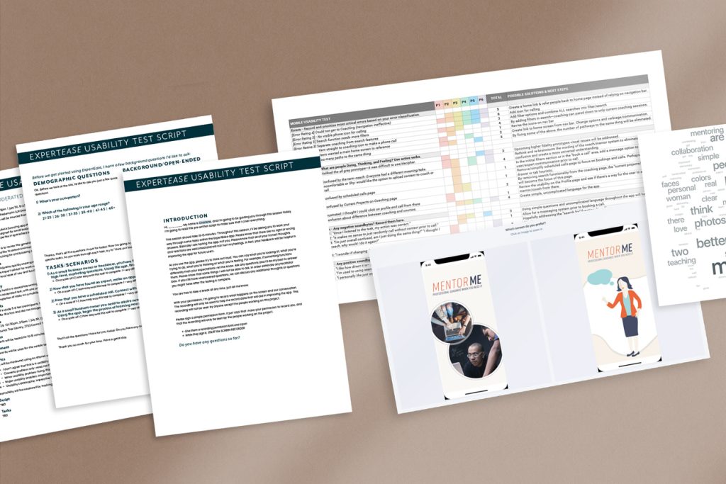
A preference test was conducted comparing an illustrative vs. a photographic splash screen design. Results were statistically inconclusive at 55%.
User Findings
User's wanted visuals to feel inclusive, cooperative, and community-oriented. Since the illustrated version received 55% of the vote, the determination was made to move forward with the illustration and adjust colors to enhance feelings of engagement and inclusivity.
