A team of 4 UX designers needed a clear and consistent way to apply colors to ensure consistency across 4 products. The team was working with duplicate and triplicate color styles created from a Figma theme builder.
My Role
UX Design, Design Systems—Color Variables
Results
50% of components were phased-out with the introduction of dark/light mode
Research & Understanding
At the start of the project, I sought to understand how the colors were being used and the amount of overlap between the color themes. The initial request was to remove the duplicate/triplicate color styles.
After gaining some clarity about the colors, I regularly met with team members to discuss and understand how they were using those colors.
Issues Discovered
1) UX designers were spending excess time finding the correct colors 2) Each designer was using colors differently 3) Color roles were not assigned correctly to reflect M3 recommendations 4) Design system components did not have correct colors assigned to the components
Steps Taken
As I studied more on design system colors, styles, and best practices, it became clear that color variables were the next step. Color variables would: 1) Enable easy color adjustments to design system components and design patterns 2) Minimize the need to re-design for dark mode
Insights on Implementation
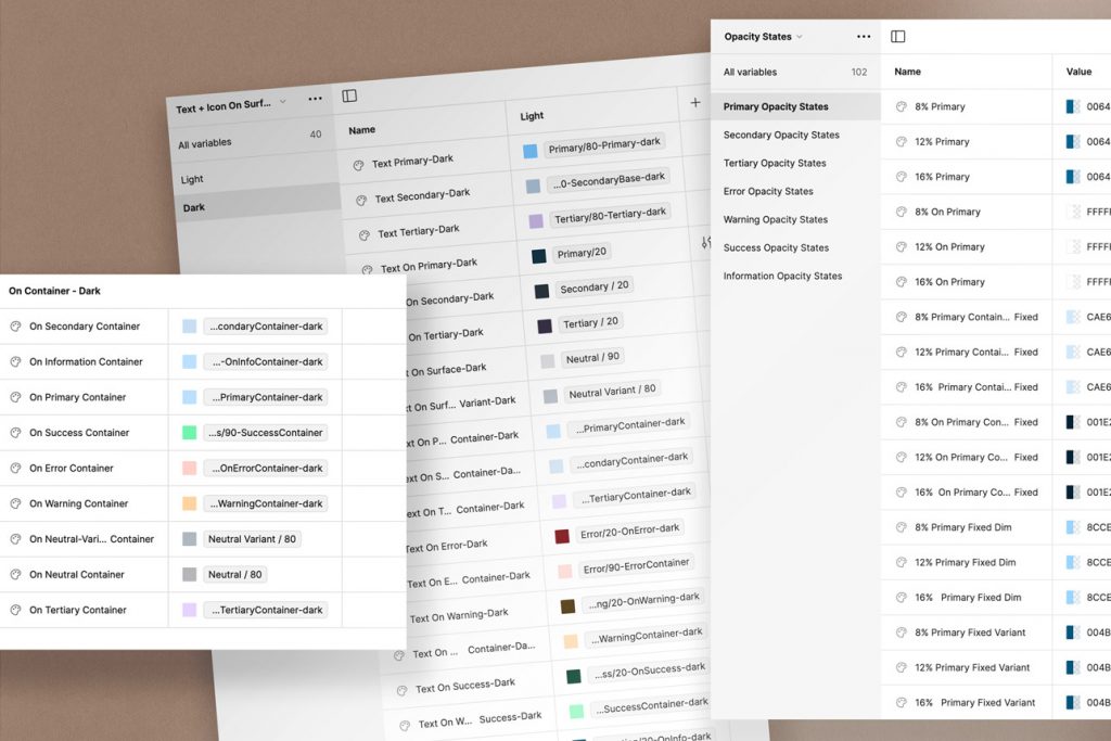
Througout the implementation the following issues were navigated: variables window in Figma is not terribly flexible when it comes to combining and reorganizing groups of variables. 1) Plan out how your variables will be organized—create strong naming conventions to reflect color states. The variables tool in Figma is not flexible in combining and reorganizing groups 2) Include the users throughout the phases of the process—get input. Users were resistant to change, despite their "need" for clarity. Each one thinks about color differently—include them in the conversation. 3) Introduce changes to your users to roll out the changes 4) Test the changes—ask users to test and comment 5) Include developers in the conversation early—dev was responsive to the reference color system as it mirrored their css coding language
Results
• Global color references are now aligned with development • State colors were created: container; on-container; surface; etc. • Light and Dark modes were introduced for all color states • 50% reduction in components due to removal of "dark" components • Introduction of dark color modes streamlines design time
Learning & Insights
1) Planning for variables should involve conversations/interviews with users, even when they are internal 2) Achieving alignment on naming conventions is essential for success 3) Creating a system of categories, will eliminate the need for external plug-ins to reorganize variable collections 4) Test the color variables—failing to do so will minimize buy-in
